ENQUIRE NOW
April 28 2022
When it comes to interior design for commercial spaces such as restaurants and bars, many tend to overlook the fact that colours play an important role.
However, did you know that colours serve as a powerful visual cue to guide one’s attention and have effects on people’s emotions? This is because colour psychology is real, which also explains why you may feel calm when staring out at the deep blue sea, for instance.
Hence, choosing the right colour scheme for your restaurant or bar is important. Here are some of the best colour schemes you can go for and how you can use them to your advantage – read on to find out more.
1. Light, neutral colours
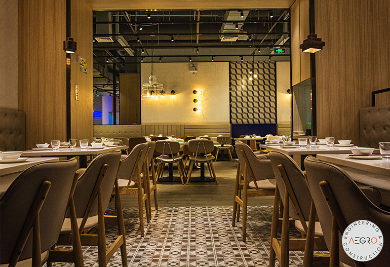
Colours such as white, beige, ivory and nude are light, neutral shades that tend to make people feel comfortable and will help to make the space look bigger at the same time. This is a great colour scheme if you are considering it for an upscale restaurant interior design to make your customers feel welcomed and relaxed while dining.
On the other hand, this may not be such a good choice if you are planning to incorporate it into a smaller eatery interior design, as this could affect the turnover rate when your customers get too comfy and stay for hours.
2. Dark colours

Darker colours like black, brown and purple give off a more luxurious and mysterious vibe which is most suitable for a bar’s interior design as well as for high-end restaurants. These colours also ooze sophistication (think luxury brands like YSL and Chanel using black in their logo) and help to create a romantic and intimate ambience.
On the flip side, too many dark colours can also make one feel cramped and claustrophobic; so the perfect balance is essential to nailing this colour scheme.
3. Pastel colours

Pastels are less saturated than primary colours and have a calming effect. They are also most commonly associated with Spring, a season that signifies rebirth and rejuvenation.
Take a look at Instagram-worthy cafes or restaurants on social media and you will probably see lots of pastel colours incorporated into the interior design as you cannot help but feel happy when looking at them.
If you are planning to attract the aesthetic-conscious crowd, a pastel colour scheme may just be the way to go.
4. Warm colours

Red, orange and yellow are considered warm colours that are stimulating and thus, associated with excitement. These shades may increase heart rate and blood flow and when that happens, it speeds up your metabolism and makes you feel hungry. This is probably one of the reasons why fast-food chains like McDonald’s and KFC all have red in their logo and restaurant interior design.
So if you are planning on making use of this to encourage your customers to order more, a warm colour scheme will do just that for you.
Nevertheless, such bright colours may also become tiresome after a while which is why it is vital not to overdo it.
5. Earth tones
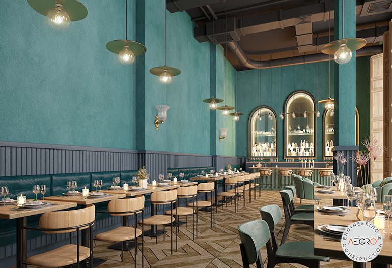
Last but not least, earth tones often found in nature like deep navy, terracotta and sage are also popular colour scheme options. Just like how Mother Nature gives off relaxing vibes, these colours will help to make your eatery interior design look and feel serene.
This colour scheme is also especially great if your business focuses on healthy food.
Keep these colour schemes in mind when renovating your next restaurant or bar interior design and we guarantee you will see the benefits.
If you are looking for an experienced interior design firm in Singapore for your commercial interior design needs, Aegro Interior may just be the one. Founded in 2007, our company has amassed a team of trustworthy contractors and creative interior designers over the years that will do their best to help you achieve what you want. Contact us today.